One of the more annoying things about the French (among many) is the fact they are more stylish and more fashion concious then us. But are they? It's a good thing this isn't a rugby blog because some of the rugby shirts worn by French clubs are so appalling and shocking that they received a higher age classification than films such as Human Centipede and all of the 97 Saw films. The powers that be will not let me show you these for fear of disturbance of the peace and causing permanent blindness from the general awfulness of the kits. However getting back to football, the two biggest French clubs are Lyon than Marseilles, though PSG's Qatari owners hope to break into the group, as Parisians hopefully they will have more style as the teams for further south. There seem to be two rules about French clubs in regards to shirts. Firstly, they have to have a hone and away shirt for domestic games and a single shirt for all European games. Secondly, the European shirt has to be cool but ugly. I will go over the past to seasons to illustrate this.
Marseilles
Home and Away 2011/2012
Two very classy kits. The home shirt is quite cool, I like the subtle blue diagonal stripes across the chest and the blue stripes on the shoulders set the whole thing off nicely. The gold chest and gold coat of arms of Marseilles (the city) in the inside collar add a touch of class to this already classy kit. The away shirt is awesome.
 |
| Classy |
The away kit is awesome. A darker shade of blue at first it look like quite an ordinary kit until you look at the chest closely and you see graffiti designs designed to reflect the urban nature of Marseilles population, the gold stripes and logos like the home kit make this already fantastic kit just that little bit better. One of the coolest kits for this season and maybe ever.
 |
| If Banksy did football kits... |
European Kit 2011/2012
The colour supposedly comes from bombers that flew over the Stade Velodrome in the 1980's. Used before but the additions of the blue stripes across the chest just makes it even more uglier. Some may disagree and for children kits like this seem cool but they aren't classy and once you get older you realise that.
 |
| If a bomber was painted this colour it wasn't a stealth bomber then... |
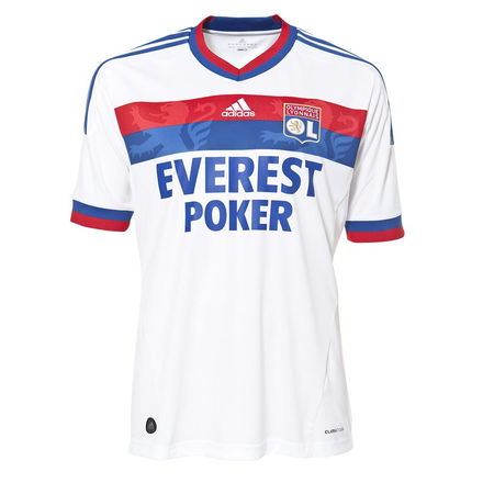
Lyon Home/Away kit 2011/2012
Lyon's traditional red and blue stripe (it supposedly makes them play better) it made even better by the two subtle lions you can see roaring on it. The red and blue also appears round the arm holes and colour and the sponsor fits the colour scheme. A stylish and sophisticated kit.
 |
| Lyon hope to roar in the Champions League... |
Like the home kit this is stylish, it is very simple a very dark blue with subtle red touches that set the hole thing off nicely and white arm holes and collar. Even the crest has been altered to match the colour scheme.
 |
|
Lyon European kit 2011/2012
The pick of the bunch in terms of ugliness, a sought of maroon colour, that in itself is ok, it's the addition of the dots and dashes of the blue dots and dashes that make the shirt look like abstract art crossed with pointillism. A truly awful kit, I don't know how they charge £44.99 for it on kitbag.com
 |
| No description available |
Going back a season to prove that this isn't just a one season thing. To speed things up I'll just look at the European kits. To see the home and away shirts click below, the Marseilles away kit isn't good or bad. The Lyon away does look like your grandmothers carpet though...
Marseilles Home 2010/2011
Marseilles Away 2010/2011
Lyon Home 2010/2011
Lyon Away 2010/2011
Marseilles European Kit 2010/2011
A Cool shirt but not stylish in anyway, the rainbow patten also repeated on the seams. The black number was loved by the young and hated by the majority of older fans. Just see for yourself...
 |
| If Cbeebies had a team this would be there away kit. |
Lyon European Kit 2010/2011
My personnel favourite, I wanted one when I first saw it. However though Lyon are my favourite French team I finally realised what a weird kit this was. Cool, not stylish, some may find it ugly, some may see it as a triumph of nylon printing. Make the choice for yourself...
 |
| Couldn't think of a good metaphor... |
As you can see the French football has style everywhere except for their European shirts. As every one in Europe seems to copy French fashion loads of big clubs have started to copy them and have horrific away or third kits. England's main offering from last season...
 |
| Maybe designed to blind their opponents... |
Barcelona have given us several neon kits in the last few seasons, this was the worst (though I like the chest stripe)...
 |
| Does the sponsor excuse this? |
Juventus returned to there old ways with this offering...
This week I have come up with an idea, if someone can come up with a good caption for this pic they can choose a Friday top 10 for two weeks away.

Can any one think of a good caption?
ReplyDeleteIf they can the Friday top 10 after tommorows (World Cup 2010 Top 10 goals) and next weeks (Champions League group stage best goals) they can pick the subject
My sister just came up with "If Justin Beiber played football..." can anyone top it?
ReplyDeleteIf Julian Clary played football? If I win, I want top ten referee errors!!
ReplyDeleteYou're in the lead tezza, can ailish or dad beat you though?
ReplyDeleteIf Cillit Bang played football.... Sorry I am tired and its been a long week. Great post though.
ReplyDeleteTezzas is still better, you guys have till after friday top ten today to get your entries in...
ReplyDeleteVoting has now closed. Read the Friday top ten to find out the winner!!!
ReplyDelete